
Your website is not a mood board. It's a sales tool. And if it's chasing design trends instead of driving decisions, it's costing you in trust, in conversions, and in the time it'll take to fix it.
The design trends startups should avoid aren't just the ones that look dated in six months. They're the ones that quietly erode user confidence, slow page loads, confuse navigation, and make your brand indistinguishable from 40 other companies in your category. This article breaks down the seven most common offenders and what smart founders do instead.
Startups should avoid over-animated hero sections, glassmorphism overload, hamburger menus on desktop, all-stock photography, dark mode without accessibility planning, empty minimalist copy, and copying competitor aesthetics. Each creates a specific business cost, from conversion loss to brand dilution.
Following design trends feels safe. It signals awareness. It makes your startup look "current."
But trend-chasing has a compounding cost: it locks your brand into a visual moment that expires, forces a redesign cycle every 18–24 months, and most importantly, makes your product look like everything else in the market.
The brands users trust most are the ones that look intentional, not trendy. Intention means every design decision connects to a strategic goal: clarity, credibility, conversion. Trendiness means design decisions connect to Dribbble and Awwwards.
Both can look beautiful. Only one of them works.
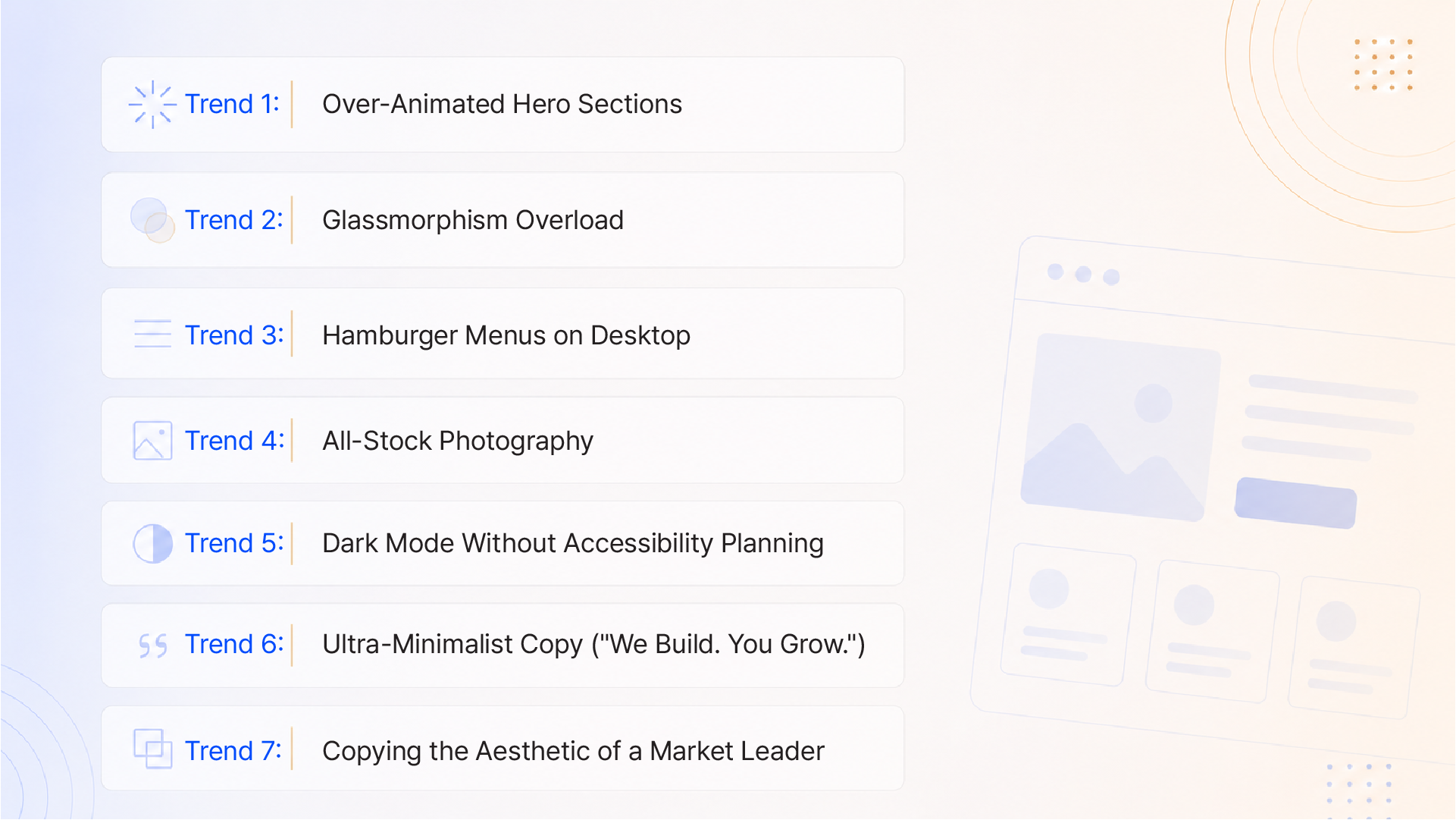
Why Startups Fall For It:
Motion feels modern. A hero section that slides, fades, parallax-scrolls, and transitions on scroll looks dynamic. It signals effort, polish, and technical capability.
The Business Cost:
Excessive animation is one of the most reliable conversion killers in startup web design. Research shows that it can increase cognitive load enough to reduce message comprehension by up to 26%. Users trying to parse your value proposition while the background is morphing cannot hold both things in working memory simultaneously.
The performance cost is equally brutal. Heavy animation scripts inflate page load time. A one-second delay alone can cause a 7% drop in conversions. And 38% of users with vestibular disorders find excessive website motion physically distressing, meaning you're actively excluding a meaningful portion of your audience before they even read your headline.
What to Do Instead:
Why Startups Fall For It:
Glassmorphism frosted glass panels, translucency, and layered blur effects look premium. It's everywhere in Figma templates, SaaS landing pages, and fintech product screenshots.
The Business Cost:
The problem isn't the aesthetic. It's what it does to readability and accessibility when overused.
Text placed over blurred, dynamic backgrounds frequently falls below the WCAG-recommended 4.5:1 contrast ratio. Users with low vision cannot parse it. Users on mid-range Android devices see a laggy, janky blur effect instead of a polished one. And the visual noise created by excessive layering collapses the information hierarchy; everything looks equally important, so nothing actually stands out.
For a startup trying to communicate a clear value proposition above the fold, that's a catastrophic UX failure dressed in good-looking clothes.
What to Do Instead:
Why Startups Fall For It:
Hidden navigation looks clean. It maximises whitespace and creates that minimal, "nothing-to-distract-you" aesthetic that feels modern and focused.
The Business Cost:
Nielsen Norman Group research is unambiguous: content hidden in navigation is discovered significantly less than content in plain sight. On desktop, where screen real estate is not a constraint, there is no UX justification for hiding your navigation.
When a potential customer lands on your site to evaluate whether you're a credible partner, they want to know immediately: what do you offer? What are your services? Where do they go to learn more? A hamburger menu forces them to discover this themselves. Most won't bother.
For a B2B startup where a single conversion might be worth ₹50 lakhs or $50,000, reducing navigation friction isn't an aesthetic choice; it's a revenue decision.
What to Do Instead:
Why Startups Fall For It:
Stock photos are fast, cheap, and look professional at a glance. For a seed-stage startup with no dedicated content budget, it feels like a practical compromise.
The Business Cost:
Users are exceptionally good at recognising stock imagery, often unconsciously. When they see the smiling diverse team in the office, the woman with a headset, the handshake between two anonymous business professionals, it registers as inauthentic. And inauthentic brands don't convert.
Research indicates that websites using authentic, business-specific photography can see up to 35% higher conversion rates compared to sites relying on generic stock images. The "ubiquity problem" compounds this: the same image library is available to your competitors. You risk being visually identical to a company in a completely different category.
What to Do Instead:
Why Startups Fall For It:
Dark mode feels sophisticated, technical, and premium, especially for SaaS, DevTools, FinTech, and anything adjacent to tech culture. It's also genuinely useful in low-light environments.
The Business Cost:
Deploying dark mode as a design trend rather than a deliberate design system creates a cascade of accessibility and consistency failures.
Text-on-dark backgrounds must meet strict contrast ratios or become unreadable for users with low vision. Secondary text, disabled states, placeholder text, and inline labels all need bespoke dark-mode treatment, and most startup design systems haven't built those states. The result: a product that looks like dark mode but has legacy light-mode components bleeding through, creating a fragmented, unpolished experience that signals "we didn't finish this."
Darker interfaces also tend to compress visual hierarchy. The differentiation between headline, body, and supporting text that is obvious on white backgrounds requires more deliberate type scale and colour decisions on dark ones.
What to Do Instead:
Why Startups Fall For It:
Compressed, punchy hero copy looks confident. It evokes Apple. It feels like a brand that doesn't need to explain itself.
The Business Cost:
Apple doesn't need to explain itself because you already know what Apple does. Your startup does.
For a growth-stage company without mass brand recognition, ultra-minimalist copy fails to do the one thing your homepage must do: tell a new visitor exactly what you do, for whom, and why that matters within the first 5 seconds. "We Build. You Grow" tells them nothing. It could be a construction firm, a SaaS platform, a fitness brand, or a consultancy.
Ambiguous copy increases the cognitive work required to evaluate you. Users who have to work to understand you will not do that work. They'll leave.
What to Do Instead:
Why Startups Fall For It:
If Stripe's design converts, and Notion's design converts, surely adopting that clean, minimal, card-heavy, Geist-font aesthetic will signal credibility by association.
The Business Cost:
Imitation doesn't borrow trust; it borrows anonymity. When your SaaS startup looks like Stripe, and so do six other SaaS startups in your category, buyers cannot differentiate you at a glance. You become a commodity before you've said a word.
Brand identity exists to reduce comparison. If your visual system can be confused with a competitor's, you've lost the one moment in the buyer journey where design could have done the selling for you: the first impression.
Trend-chasing has a compounding cost for brand longevity. Brands built around a moment's aesthetic require a redesign the moment that aesthetic falls out of favour. Brands built on a distinctive system own their visual territory indefinitely.
What to Do Instead:
Every trend on this list is a version of the same mistake: optimising for how design looks, not what it does.
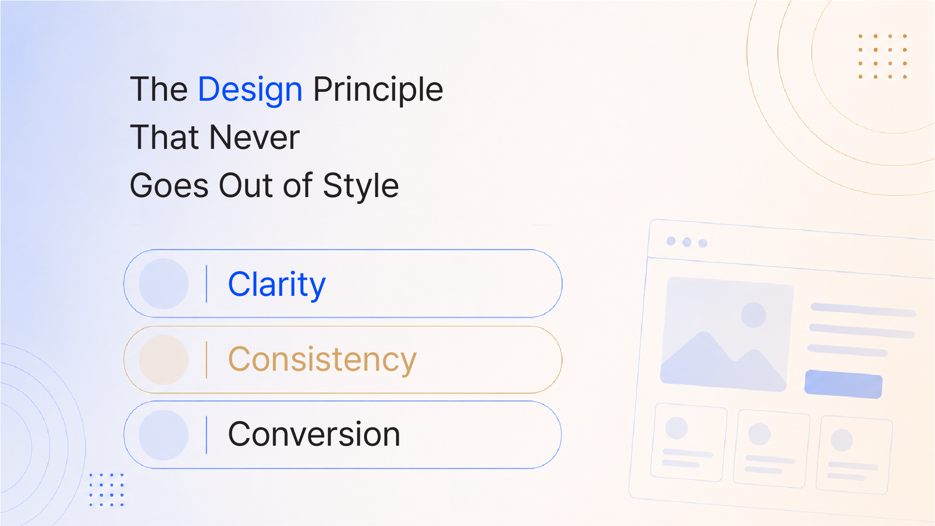
The antidote is not conservatism. It's intentionality. Timeless design, the kind that works in year one and year ten, is built on three things:
Design fads come and go. User cognition doesn't. People have always responded to legibility, trustworthiness, and ease. The studios that understand this treat design as a strategic discipline, not a styling exercise.
When your brand looks intentional, users trust you. When they trust you, they convert. When they convert, your design was worth every rupee you spent on it.
At Integra Magna, we design for outcomes, not aesthetics. Our process connects brand strategy, visual identity, UX architecture, and web development into a single system built to perform now and scale with your business.
If your brand doesn't feel premium enough, your website isn't converting, or everything feels scattered let's fix the system, not just the surface.
Q1: What are the most common design trends startups should avoid?
The most damaging design trends for startups include: over-animated hero sections that hurt page performance and comprehension, glassmorphism overload that fails accessibility standards, hamburger menus on desktop that hide navigation and reduce conversions, all-stock photography that erodes brand authenticity, and ultra-minimalist copy that fails to communicate your value proposition clearly. Each trend creates a specific business cost beyond just looking dated.
Q2: Why do trendy websites often fail to convert?
Trendy websites typically prioritise how they look over how they work. Excessive animation increases cognitive load, making it harder for users to process your value proposition. Hidden navigation increases interaction cost. Ambiguous hero copy fails the "5-second test." Collectively, these choices create friction at exactly the moment a user is evaluating whether to trust you and friction kills conversions.
Q3: Does following design trends hurt startup branding long-term?
Yes, significantly. Trend-dependent brands require frequent redesigns typically every 18–24 months to stay current. Each redesign erodes accumulated brand recognition and forces the business to re-educate its audience. Brands built on strategic, timeless design systems retain equity over time and become more recognisable, not less, as they mature.
Q4: How does dark mode affect startup website usability?
Dark mode, when implemented as a trend rather than a planned design system, creates readability and consistency failures. Text contrast frequently falls below WCAG 2.1 AA standards, and components designed for light mode bleed through as incomplete dark-mode