
Most startup branding mistakes don't announce themselves. They don't crash your website or tank your ad spend overnight. They bleed you slowly in lost trust, lukewarm first impressions, and deals that almost closed.
The most damaging startup branding mistakes are skipping brand strategy, inconsistency across touchpoints, designing for an undefined audience, copying competitors, ignoring first-impression mechanics, omitting trust signals, and building a brand that doesn't scale. Fix these seven, and your brand stops working against your sales team.
The data is clear: 81% of consumers require trust in a brand before making a purchase. And 40% will never return after that trust is broken. For a startup with a thin margin for error, your brand is either your best salesperson or your worst liability.
The most common startup branding mistakes fall into two categories: strategic failures (no brand positioning, wrong audience, copied competitors) and executional failures (inconsistency, poor visual hierarchy, missing trust signals). Most guides only address the executional. This article addresses both because the executional failures are almost always downstream of the strategic ones.
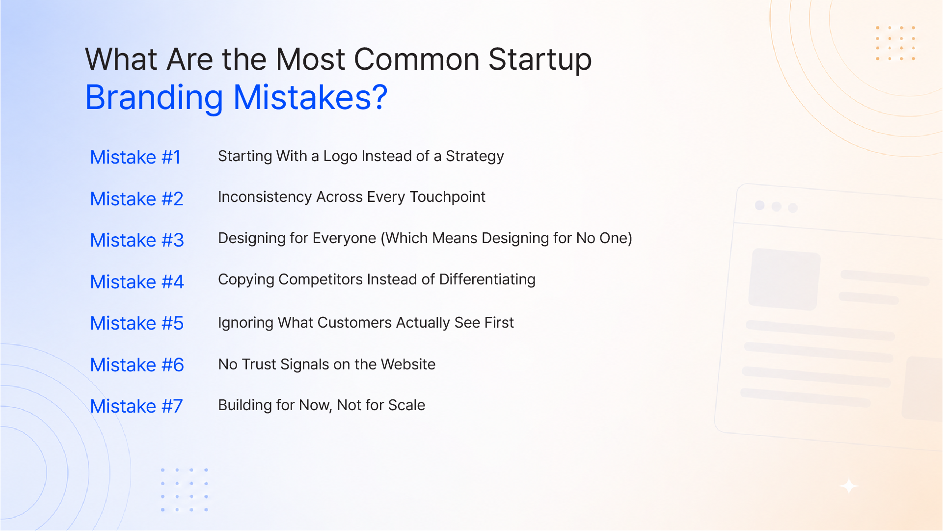
This is the founding error. A founder signs up for a design tool, spends three weeks iterating on logos, and ships a brand with no idea who it's actually for, what it stands for, or how it should sound.
A logo is the handshake. Brand strategy is the relationship. Without strategy, your logo has no context, no meaning for your customer to latch on to.
Brand Strategy Is the Load-Bearing Wall; Design Is the Paint
Think of your brand as a building. The visual identity logo, colors, and typography are the paint on the walls. The brand strategy is the structural frame: your positioning, your audience definition, your unique value proposition, your tone of voice.
You can repaint a building in a weekend. You cannot move a load-bearing wall without consequences.
Startups that skip strategy find themselves rebranding within 18 months, a costly exercise that could have been avoided.
What to Define Before You Touch a Design Tool
Before briefing any designer, lock in:
Only then should pixels be placed.
"Brands with consistent presentation are 3.5x more likely to enjoy excellent brand visibility and can increase revenue by up to 33%."
This is not a design preference. It is a commercial metric.
When your website uses one font family, your pitch deck uses another, your Instagram has a third color palette, and your email signatures look like they came from a different company, customers notice. They may not articulate it, but they feel it.
The human brain reads inconsistency as a warning signal. Inconsistency means unpredictability. Unpredictability means risk. And customers don't buy from brands that feel risky.
Why the Brain Reads Inconsistency as Incompetence
Cognitive science is unambiguous on this: familiarity breeds trust. When every brand touchpoint reinforces the same visual and verbal identity, your audience builds a mental model of your company. That model creates confidence.
Break that consistency even once, on one channel, and you introduce doubt. Doubt is fatal in the consideration stage.
Only 30% of companies with brand guidelines actually enforce them consistently, despite 85% having them in place. The gap between having a brand system and running one is where most startups bleed.
The Brand Consistency Audit Checklist
Run this across every customer-facing asset:
If any asset looks like it came from a different company, it's a trust vulnerability.
When a startup tries to appeal to every possible buyer, its messaging becomes so diluted that it connects with none of them.
"We help businesses grow" is not positioning. It's a placeholder for positioning.
Specificity is a feature, not a limitation. When your brand clearly speaks to a defined audience, their specific pain, their specific context, their specific aspiration, those people feel seen. That emotional recognition is what drives inbound interest and word-of-mouth.
The Clarity Trap
The fear behind broad messaging is real: "What if we exclude potential customers by being too specific?"
The counterintuitive truth: narrow, specific messaging attracts more customers because it signals deep expertise. A founder who says "We design for FinTech SaaS companies scaling from Series A to Series B" is far more compelling to a FinTech founder than one who says "We work with all kinds of businesses."
The first message earns a call. The second earns a polite decline.
Brands that study competitors too closely start to look like them. They adopt the same color families (blue for trust, green for growth), the same sans-serif fonts, the same hero section layouts, the same "simple, powerful, reliable" messaging.
The result: an industry that looks like a family reunion. Everyone is vaguely familiar. No one memorable.
The "Safe Brand" Trap
Playing it safe is not safe. It's strategically costly. When your brand blends into the competitive landscape, you force customers to compete on price because they have no other differentiator to use.
Differentiation doesn't mean being weird. It means being specific. A distinct point of view, a distinctive visual system, a brand voice that doesn't sound like every other player in your category, these are the signals that earn attention and justify premium pricing.
Study competitors to understand the category conventions. Then make deliberate decisions about which conventions to break.
55% of a brand's first impression is visual. That impression forms in under 50 milliseconds.
Your website's hero section, your Instagram grid, the thumbnail on your YouTube video, the layout of your pitch deck, these are not "just design." They are your first sales conversation. And most startups conduct that conversation poorly.
Weak visual hierarchy, cluttered layouts, stock photography that signals inauthenticity, and fonts that don't reflect the brand's personality all of these communicate something. Usually the wrong thing.
This deserves its own mention because the impact is direct and measurable.
A startup website without trust signals is a closed door dressed as an open one. Trust signals include:
In a post-trust era where consumer skepticism is the default, the absence of social proof is interpreted as an absence of credibility.
A startup's logo is designed for a website header. Two years later, it needs to appear on a mobile app icon, a product packaging label, a trade show banner, a partnership co-branded lockup, and an animated social post.
If the original mark was designed only for one context, every new application is a compromise. Those compromises accumulate into a visual identity that looks stretched, inconsistent, and unprofessional at exactly the moment the company is trying to look its most credible.
Brand scalability is a design requirement, not a nice-to-have. A proper brand system anticipates future contexts and builds flexibility in from the start.
Correcting startup branding mistakes is significantly cheaper when caught early. Here's a phased approach:
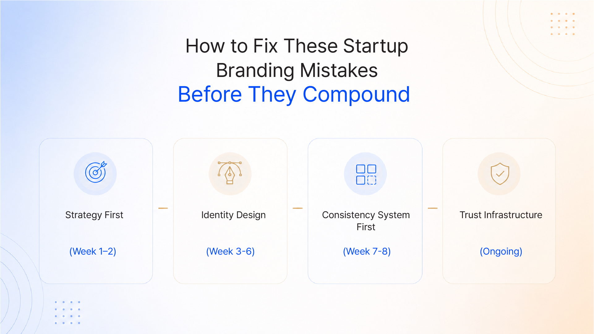
Phase 1 Strategy First (Week 1–2)
Phase 2 Identity Design (Week 3–6)
Brief a designer against your strategy document, not a mood board. Build a complete visual system: logo suite, color palette, typography, iconography. Document all brand guidelines in a living guide (not a static PDF).
Phase 3 Consistency System (Week 7–8)
Audit all existing touchpoints against the new brand guidelines. Create master templates for recurring assets (decks, emails, social posts). Centralize brand assets in a shared folder accessible to all team members.
Phase 4 Trust Infrastructure (Ongoing)
Actively collect and display testimonials and case studies. Build a case study for every significant client win. Schedule a brand audit every 6 months.
The goal is not perfection on day one. The goal is a coherent system that improves with every iteration.
Build a Brand That Earns Trust Before the First Conversation
Startup branding mistakes are not aesthetic failures. They are strategic ones, and their consequences show up in the pipeline, not just pixels. When your brand is inconsistent, generic, or built without a strategy, it doesn't just look unprofessional. It loses deals.
The good news: these are all fixable. And the earlier you fix them, the cheaper it gets.
At Integra Magna, we work with growth-stage founders to build brand systems, not just visual deliverables. We connect strategy, design, and technology into a single coherent output that works harder than any individual asset.
If your brand feels scattered, generic, or like it's working against your sales team, let's talk.
Q1: What is the most common startup branding mistake?
The most common startup branding mistake is starting with visual design (logos, colors) before defining brand strategy. Without a clear positioning, target audience, and tone of voice, the design has no foundation and typically needs to be redone within 12–18 months.
Q2: How does inconsistent branding hurt a startup?
Inconsistent branding signals unprofessionalism and unpredictability to potential customers. Research shows that brands with consistent presentation can increase revenue by up to 33%, while inconsistent brands lose visibility and erode trust at every touchpoint from social media to email signatures to website design.
Q3: Why do startups fail at building a brand identity?
Startups most commonly fail at brand identity because they treat branding as a task (get a logo, pick colors) rather than a system (positioning + visual identity + brand voice + trust infrastructure). They also frequently skip audience definition and build for a generic "everyone" rather than a specific, high-fit buyer.
Q4: How long does it take to build a trustworthy startup brand?
A foundational brand covering strategy, visual identity, guidelines, and core templates typically takes 6–10 weeks when working with an experienced studio. Trust signals (testimonials, case studies) are built over time, but the infrastructure to collect and display them should be in place from launch.
Q5: Can a startup rebrand without losing existing customers?
Yes, if the rebrand is handled as a strategic evolution rather than an abrupt pivot. Communicating the "why" behind a rebrand, maintaining consistency in core values and brand voice, and phasing the visual transition across touchpoints minimizes disruption. Most customers respond positively to brands that show growth and intentionality.