Your B2B website shouldn't just look good; it needs to be your most effective, highest-performing sales representative. In an era where buyers prefer self-education over immediate sales calls, your site is the front line of your revenue engine.
How can a B2B website drive more pipeline? A high-performing B2B website drives pipeline by clearly articulating the value proposition within three seconds, streamlining the buyer's journey with intuitive navigation, leveraging authoritative social proof, and utilizing strategically placed, friction-free conversion points. When design decisions are rooted in revenue rather than aesthetics, your website consistently transforms traffic into qualified sales opportunities.
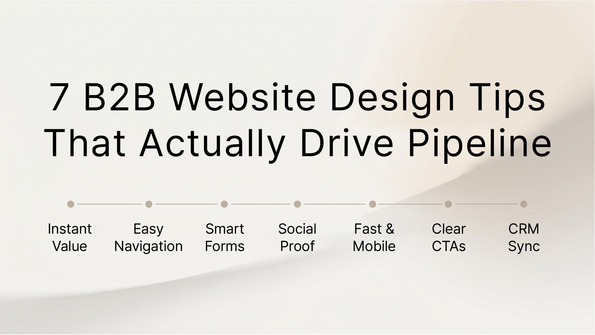
Here are the seven B2B website design principles that separate high-growth companies from the rest.
Historically, B2B companies viewed their websites as digital brochures a static collection of product features and an "About Us" page. Today, that approach is a pipeline killer. Research indicates that modern B2B buyers complete up to 70% of their buying journey before ever speaking to a sales representative. If your site doesn't educate, build trust, and seamlessly guide the prospect toward a conversion, you are losing deals to competitors who do.
Design is no longer just about color palettes or typography; it is about user experience (UX) and conversion rate optimization (CRO). Every pixel must serve the singular goal of moving a qualified buyer through the sales funnel.
1. Master the Three-Second Value Proposition
When a prospect lands on your homepage, you have approximately three seconds to answer three critical questions: What do you do? Who is it for? And why should they care? If your hero section relies on vague corporate jargon, visitors will bounce.
A strong value proposition is clear, concise, and outcome-oriented.
Weak: "Empowering enterprise synergy through next-gen solutions."
Strong: "Automate your accounting workflows to save 20 hours a week."
Use a bold, highly readable H1 headline that speaks directly to the target audience's pain point, supported by a brief subheadline that explains how you solve it.
2. Streamline the Buyer's Journey with Intent-Based Navigation
One of the most common B2B web design mistakes is structuring the top navigation menu based on the company's internal org chart rather than the buyer's journey. Your navigation must be intuitive and intent-based.
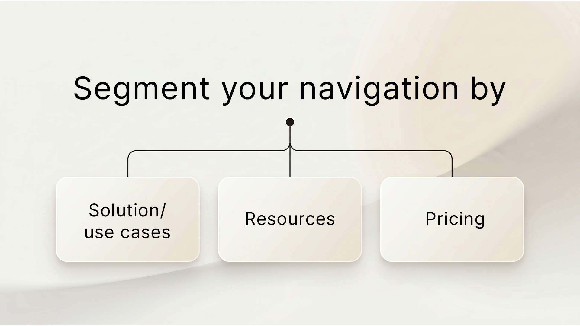
Segment your navigation by:
By reducing cognitive load and limiting choices to what actually matters to the buyer, you reduce friction and keep prospects moving through the funnel.
3. Deploy Strategic Friction in Registration and Forms
When designing forms for a B2B lead generation website, the conventional wisdom has always been "shorter is better." However, for complex B2B sales cycles, lead quality often trumps lead quantity.
This is where strategic friction comes into play. If your sales team is drowning in unqualified leads, adding a few qualifying questions to your forms can dramatically improve pipeline health. Alternatively, utilize progressive profiling a smart form technology that asks for new information only when a returning visitor downloads another asset. This lowers the barrier to entry initially while building a rich buyer profile over time.
4. Lead with Authoritative Social Proof
In the B2B space, trust is the ultimate currency. Enterprise buyers are making high-stakes, high-cost decisions. Your design must implicitly communicate reliability and authority.
Weave social proof intrinsically throughout the page design:
Social proof should not be hidden on a dedicated "Testimonials" page; it must be a core element of your site's narrative flow.
5. Optimize for Site Speed and Mobile Responsiveness
Performance is a fundamental design feature. According to Google, as page load time goes from one second to three seconds, the probability of bounce increases by 32%. A slow site signals to buyers that your software or service might also be clunky and outdated.
Furthermore, while B2B conversions predominantly happen on desktop, initial discovery often occurs on mobile devices. A truly responsive design ensures that formatting, form fields, and navigation are seamless regardless of screen size. Heavy animations or oversized images that choke load times are actively destroying your pipeline.
6. Implement Clear and Contextual Calls to Action (CTAs)
"Submit" and "Click Here" are not compelling CTAs. A high-converting CTA is action-oriented, contextual, and explicitly states the value the user will receive upon clicking.
Instead of generic buttons, try:
Furthermore, ensure there is a clear visual hierarchy. Your primary CTA (e.g., "Book a Demo") should stand out with a contrasting brand color, while secondary CTAs (e.g., "Read the Guide") can be outlined or ghost buttons.
7. Integrate Seamlessly with Your CRM and Tech Stack
The most beautiful B2B website design is useless if it exists in a silo. True pipeline generation requires deep integration between your website's front end and your CRM back end.
Ensure that your form submissions instantly map to the correct properties in Salesforce or HubSpot. Set up lead routing rules so that a high-intent prospect requesting a demo receives a follow-up email immediately. Speed to lead is a critical metric; modern web design must facilitate instantaneous sales handoffs.
B2B website design is not an IT project or a pure branding exercise it is a critical commercial initiative. By focusing on a clear value proposition, intent-based navigation, strategic social proof, and seamless CRM integrations, you transform your website into an automated pipeline generation engine. Stop treating your site like a digital brochure, and start designing it to sell.
Ready to see how your website measures up? Book a call with Integra Magna today, and let's turn your traffic into revenue.
What makes a good B2B website?
A good B2B website prioritizes the buyer's journey. It features a clear value proposition, intuitive navigation, fast load speeds, compelling social proof, and frictionless conversion points that seamlessly integrate with a CRM to assist the sales process.
How often should a B2B website be redesigned?
Most high-growth B2B companies redesign or significantly refresh their websites every 18 to 24 months. However, adopting a "growth-driven design" approach making continuous, data-backed micro-improvements is highly recommended over waiting years for a massive overhaul.
How can a B2B website directly drive more pipeline?
A B2B website directly drives pipeline by ranking well in search engines to attract qualified traffic, quickly answering the user's core questions (satisfying search intent), and using optimized forms and contextual CTAs to capture leads and route them instantly to the sales team.