
Open five startup websites right now. Chances are, you'll see the same hero section with a bold headline on the left and a product mockup on the right. Below that: three feature cards. Then a social proof strip of logos. Then a pricing table. Then a footer.
Most startup websites look identical because they're built using the same tools, optimized with the same A/B-tested playbook, and designed to signal the same kind of "modern tech credibility." This is rational, but it's quietly destroying brand differentiation across the industry.
Here's what's actually happening, why it matters, and what founders and designers can do about it.
Speed kills creativity, and startup culture worships speed.
The pressure to ship an MVP fast means most founding teams reach for the fastest, "safest" tool available: a pre-built Framer template, a Webflow theme, a Tailwind-based component library. These tools are excellent. They're also trained on and optimized for the same set of high-performing layouts.
The result is structural:
No individual is making a bad decision. But collectively, the ecosystem is funnelling thousands of different companies into the same visual lane.
Key Insight: Design homogeneity isn't a creative failure. It's a systemic one built into the tools and incentives of the startup world.
There's a reason founders aren't pushing back on this. Familiar design works at least in the short term.
Cognitive load theory tells us that users expend less mental energy on interfaces they recognize. A predictable hero section, standard navigation, and familiar CTA placement reduce friction and can meaningfully improve conversion rates for first-time visitors.
This creates a powerful psychological trap:
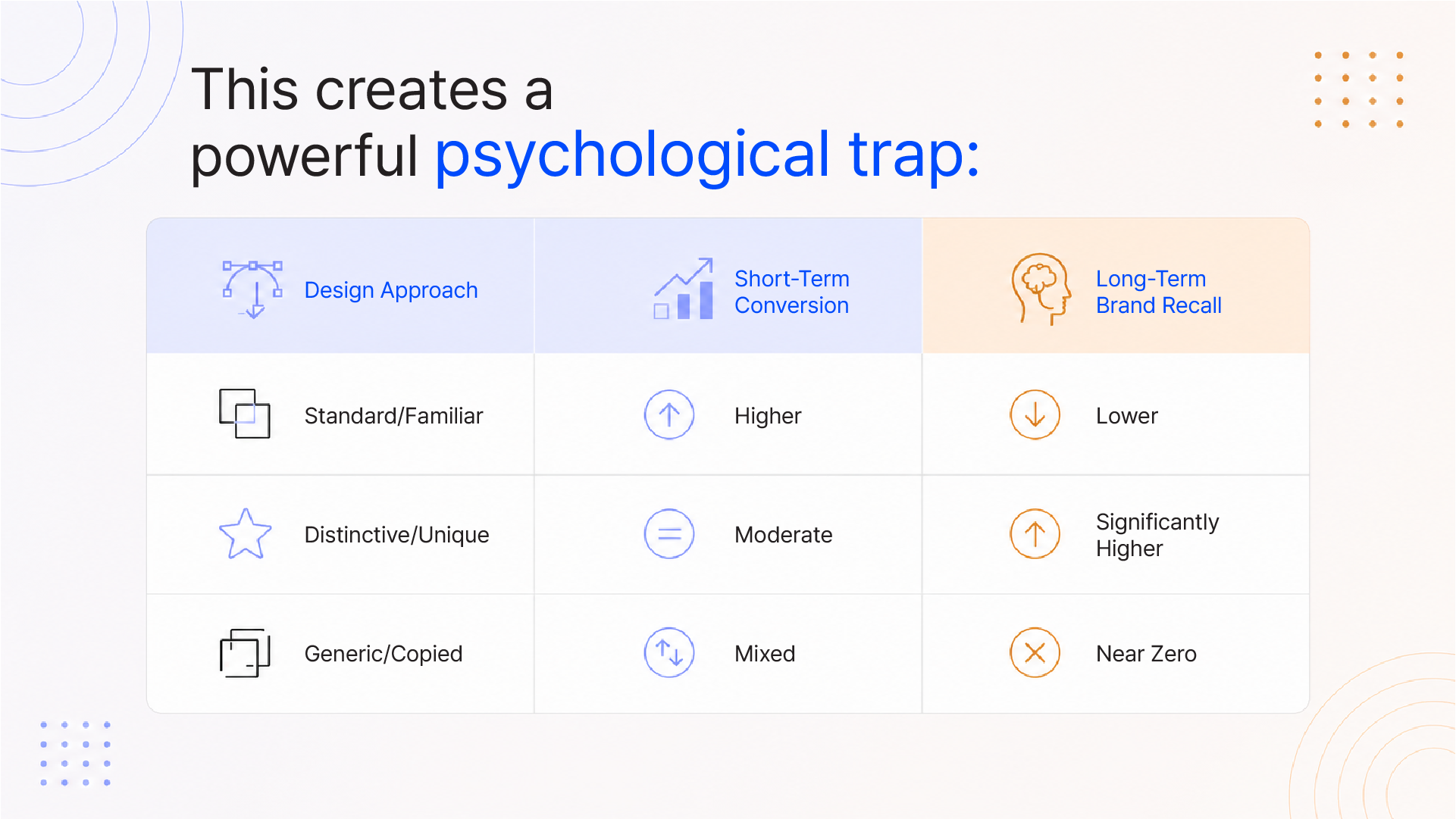
Standard/Familiar Higher Lower Distinctive/Unique Moderate Significantly Higher Generic/Copied Mixed Near Zero
The danger isn't that a familiar design performs badly on day one. It's that it performs indistinguishably over time. When users can't remember which brand offered which promise, you're not building a business; you're building a commodity.
Mimicking Success: The Stripe/Linear Aesthetic Problem
The most insidious driver of startup design sameness isn't laziness; it's aspiration.
Walk through any Y Combinator batch, and you'll find companies whose visual identity is unmistakably modelled on Stripe, Linear, or Vercel. Clean inter typeface. Neutral dark palette. Generous whitespace. Subtle gradients. Sleek product screenshots.
This aesthetic evolved for a reason. Stripe needed to signal enterprise-grade trust to CFOs approving payment infrastructure. Linear needed to project engineering precision to developer teams evaluating project management tools. These are highly specific brand signals for highly specific audiences.
When a B2B SaaS tool for restaurant inventory management adopts the same aesthetic, those signals lose all meaning. You end up with a brand that says nothing about who it's actually for.
The Stripe aesthetic is a language. Copying the language without having anything to say leaves you fluent in a language with nothing worth communicating.
Design homogeneity is more than an aesthetic problem; it's a business risk.
Consider what brand differentiation actually does:
Research from Nielsen Norman Group shows that users form impressions of a website within 50 milliseconds. If your visual language signals "SaaS startup," you've burned that window with zero differentiation.
73% of consumers say that brand experience influences their purchasing decisions (PwC, 2023). When every startup offers the same brand experience, the decision defaults to price, product feature, or whoever got to the customer first.
This isn't an argument against conversion-focused design. It's an argument for both.
The most distinctive digital brands, Notion, Duolingo, Monzo, and Glossier, all share a common approach: they built a recognizable visual language before they built a conversion-optimized layout.
What separates them from the pack:
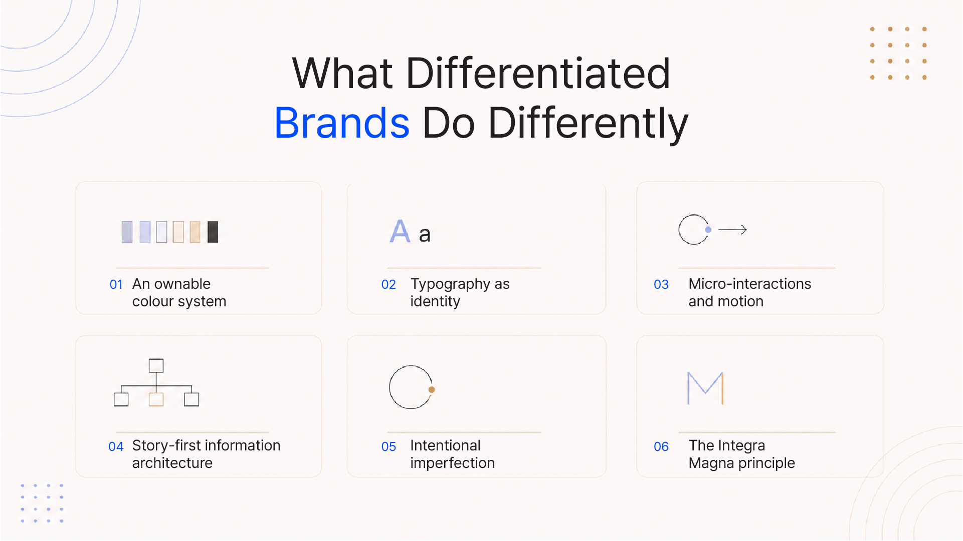
The Integra Magna principle: Conversion without identity is a leaky funnel. You can optimize the journey endlessly, but if users can't remember who sent them on it, you'll keep paying to acquire the same stranger.
Here's the practical path:
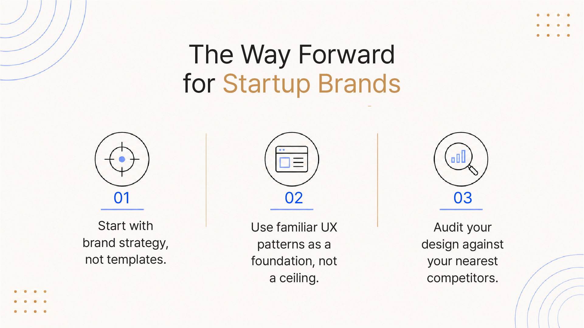
Startups that break the mold don't abandon usability. They layer identity on top of it, and that's where lasting brand equity lives.
Ready to build a website that doesn't look like everyone else's? Integra Magna helps ambitious startups develop brand identities and digital experiences that are strategically distinctive and conversion-ready.
Q: Why do all startup websites look the same?
Most startup websites look alike because founders rely on the same UI frameworks, no-code templates, and AI builders, all of which default to the most popular, A/B-tested layouts. The pressure to launch fast discourages investment in distinctive visual identity.
Q: Is using a website template bad for startup branding?
Not inherently. Templates provide solid UX foundations and speed up launch timelines. The problem arises when teams don't layer a distinctive brand identity on top of the template, leaving a generic-looking site that says nothing unique about the company.
Q: How do I make my startup website stand out?
Start with brand strategy: define your visual language (colour, type, motion), create a distinct voice, and design with your specific audience's psychology in mind. Evaluate your site against competitors; if you look interchangeable, prioritize visual differentiation over marginal UX tweaks.
Q: What is the "Stripe aesthetic" in design?
The "Stripe aesthetic" refers to a widely mimicked design language of clean sans-serif typography, neutral dark/white palettes, generous whitespace, and product-forward layouts popularized by Stripe, Linear, and Vercel. It signals technical precision and enterprise trust, but has become so ubiquitous it no longer differentiates.
Q: Does a unique website design hurt conversions?
Distinctive design does not inherently hurt conversions. Research shows that brands with strong visual identities outperform generic ones in long-term customer acquisition and retention. The key is to maintain intuitive UX patterns while differentiating at the visual identity layer.