
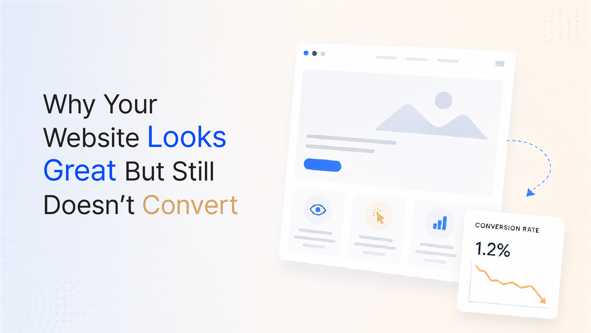
You signed off on the design. You approved the typography, the colour palette, and the layout. The photography is sharp. The animations are smooth. On paper and on screen, it looks exactly right.
But your website is not generating leads. Visitors arrive, spend ninety seconds scrolling, and leave without filling in a form, clicking a button, or picking up the phone.
The instinct is to blame the traffic on the wrong audience, the wrong channel, or the wrong ad. But when the pattern repeats across months and multiple traffic sources, the problem is rarely the audience. The problem is that your website is designed to impress visitors, not to convert them. These are not the same objective, and most businesses confuse them.
The direct answer: Beautiful websites fail to convert because they are optimised for aesthetic approval, not for buyer psychology. Conversion is driven by clarity of value proposition, reduction of friction, and strategic placement of trust at the exact moment a visitor decides to act, not by visual sophistication alone.
The data points to a consistent pattern: design quality and conversion performance are not correlated in the way most businesses assume.
The gap between looking impressive and performing well commercially is the central problem. A website can be genuinely beautiful and still fail every buyer at the moment they need reassurance, clarity, or a reason to act.
Every visitor who arrives on your website arrives with an implicit question: Is this the right place for me?
They need that question answered in seconds. If your homepage leads with a brand tagline, a fullscreen video, or a generic "welcome to our world" headline, you are delaying the answer and losing the visitor before they ever understand what you actually do.
The 5-second test: Can a new visitor, in five seconds, answer the following three questions?
If the answer to any of these is unclear, your homepage is failing regardless of how it looks.
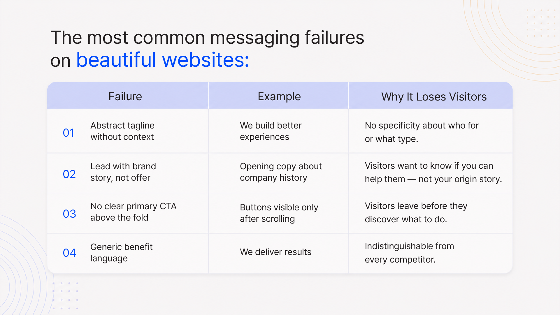
What clarity looks like: A value proposition that names the audience, names the outcome, and names the category in plain English, above the fold, within the first three seconds.
There is a fundamental difference between design-first thinking and psychology-first thinking, and most website projects are led by the former.
Design-first thinking asks: Does this look impressive? Is the layout balanced? Does the colour palette feel premium?
Psychology-first thinking asks: Where does a visitor's eye land first? What does it tell them? What is the emotional state of someone arriving on this page, and what do they need to feel or understand to take the next step?
Elegant layouts can actively work against conversion when they:
Key insight: A website designed purely for visual impact is often designed for the business owner's approval, not for the customer's confidence. These are fundamentally different briefs.
Good UX design is not about making something look better. It is about making the right thing easier to do. When those two objectives are aligned, conversion follows. When they are not, traffic becomes a vanity metric.
Research consistently shows that UX improvements- structural and behavioural improvements, not visual ones can increase conversion rates by up to 400%.
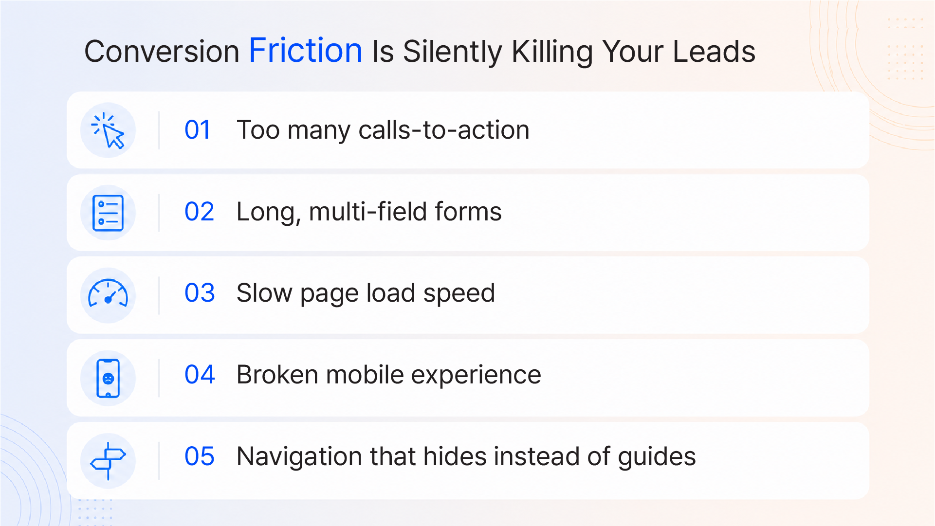
Every point where a user has to stop, think, decide, or wait is a point of friction. Every friction point reduces the probability of conversion. And most businesses are adding friction at exactly the moments that matter most.
The most common friction points:
You're Missing Trust at the Moment It Matters Most
Most businesses know they need trust signals: testimonials, case studies, client logos, awards. The error is not in having them. It is in placing them at the wrong point in the buyer journey.
Where trust signals typically appear: Bottom of the homepage. A dedicated "Testimonials" page. A "Work" section buried under two navigation layers.
Where trust signals need to appear: Adjacent to every point of decision, immediately beside your primary CTA, within the section that describes your service, at the moment a visitor is deciding whether to fill in a form.
Trust signals that convert, placed strategically:
75% of users judge business credibility based on website design. But credibility is not just visual it is evidential. It comes from proof that is visible, specific, and placed where a buyer needs it.
Before investing in a redesign, run a structured diagnostic. Most conversion problems can be identified without a full rebuild.
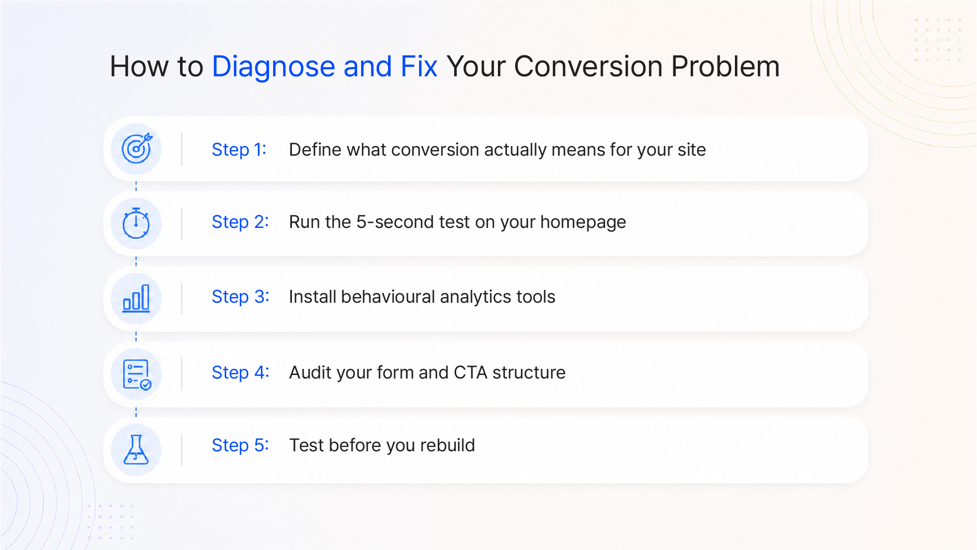
Step 1: Define what conversion actually means for your site
Before measuring anything, define your primary conversion event: Is it a form submission? A call booking? A quote request? Many businesses track "time on site" and "pages per session," neither of which is a conversion. Know what you are measuring.
Step 2: Run the 5-second test on your homepage
Show your homepage to three people unfamiliar with your business. Ask them what you do, who you serve, and what they would click next. Their answers will reveal your clarity gaps immediately.
Step 3: Install behavioural analytics tools
Tools like Microsoft Clarity (free), Hotjar, or FullStory generate heatmaps and session recordings that show where users click, scroll, and stop. Review 20–30 session recordings for your homepage and primary landing pages. You will see the friction in real time.
Step 4: Audit your form and CTA structure
How many fields does each form have? How many CTAs appear on each page? Are CTAs placed above the fold? What happens after submission? Is there a clear confirmation and next step? Document every friction point.
Step 5: Test before you rebuild
Before commissioning a full website redesign, test specific hypotheses. Simplify one form. Rewrite one homepage headline. Move one testimonial next to a CTA. Run each change for two to four weeks and measure the impact. Data-informed redesigns cost less and deliver more than instinct-driven ones.
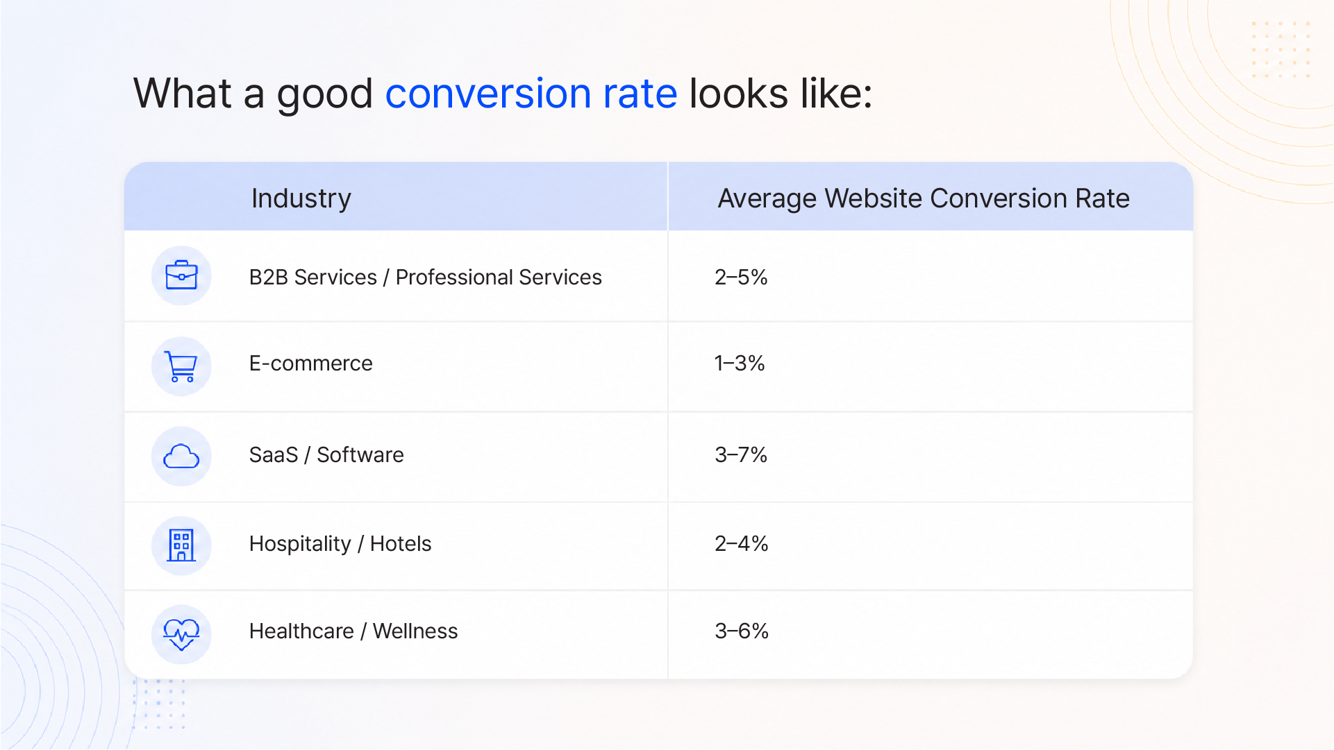
B2B Services / Professional Services 2–5% E-commerce 1–3% SaaS / Software 3–7% Hospitality / Hotels 2–4% Healthcare / Wellness 3–6%
If your conversion rate is significantly below these benchmarks, the problem is structural, not cosmetic.
A beautiful website is not the same as a high-converting website. They are built from different philosophies, optimised for different outcomes, and evaluated against different criteria.
The businesses that generate consistent leads from their website have made a deliberate decision to put the buyer's journey before visual expression. That does not mean the design is sacrificed; the most effective websites are both well-designed and structurally sound. But the structure of the information architecture, the CTA logic, the trust placement, and the friction removal come first.
If your site looks right but does not perform, the gap is rarely fixed by adding more visual polish. It is fixed by a clear-eyed audit of what buyers need at each stage of their journey, and a redesign that puts those needs at the centre.
At Integra Magna, we design websites with conversion logic built into the structure, not added as an afterthought. If you want an honest assessment of why your website is not converting and a specific plan to fix it, let us talk.
Why is my website not converting visitors into leads?
The most common reasons are: an unclear value proposition that fails to immediately tell visitors what you do and who you serve; conversion friction from slow load times, complex navigation, or multi-field forms; missing or misplaced trust signals (testimonials and case studies positioned where buyers cannot see them); and competing calls-to-action that prevent visitors from knowing what to do next. Most conversion problems are structural and informational, not visual.
What is a good website conversion rate?
For B2B services and professional services businesses, a healthy website conversion rate typically falls between 2–5%. E-commerce sites generally see 1–3%. SaaS and software products often achieve 3–7% for free trial or demo requests. If your rate is below 1%, the problem is structural and warrants a systematic audit before any further traffic investment.
Does website design actually affect conversion rate?
Yes, significantly but not in the way most businesses assume. Good design improves conversion not by looking impressive, but by creating clear information hierarchy, reducing cognitive friction, and placing trust signals and CTAs where buyers need them. Studies show that UX improvements structural, behaviour-led design decisions can increase conversion rates by up to 400%. Poor UX consistently reduces conversion regardless of visual quality.
What is the biggest mistake businesses make with their website?
Designing for the business owner's aesthetic preferences rather than the customer's decision-making process. This shows up as homepage copy that leads with brand story instead of buyer value, testimonials buried at the bottom of a page, too many competing CTAs, and forms that ask for more information than needed to start a conversation. The goal of a commercial website is not to impress it is to convert.
How long does it take to improve website conversion rates?
Some improvements simplifying a form, rewriting a headline, moving a CTA can show measurable impact within two to four weeks when tested systematically. A structural redesign or full CRO audit typically takes four to twelve weeks to implement and six to twelve weeks to yield statistically significant data. The fastest improvements come from targeted, data-informed changes to your highest-traffic pages, not a full rebuild.